

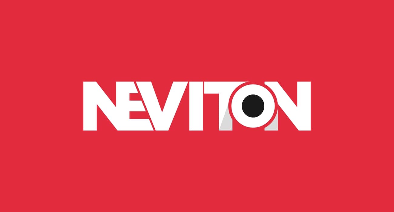
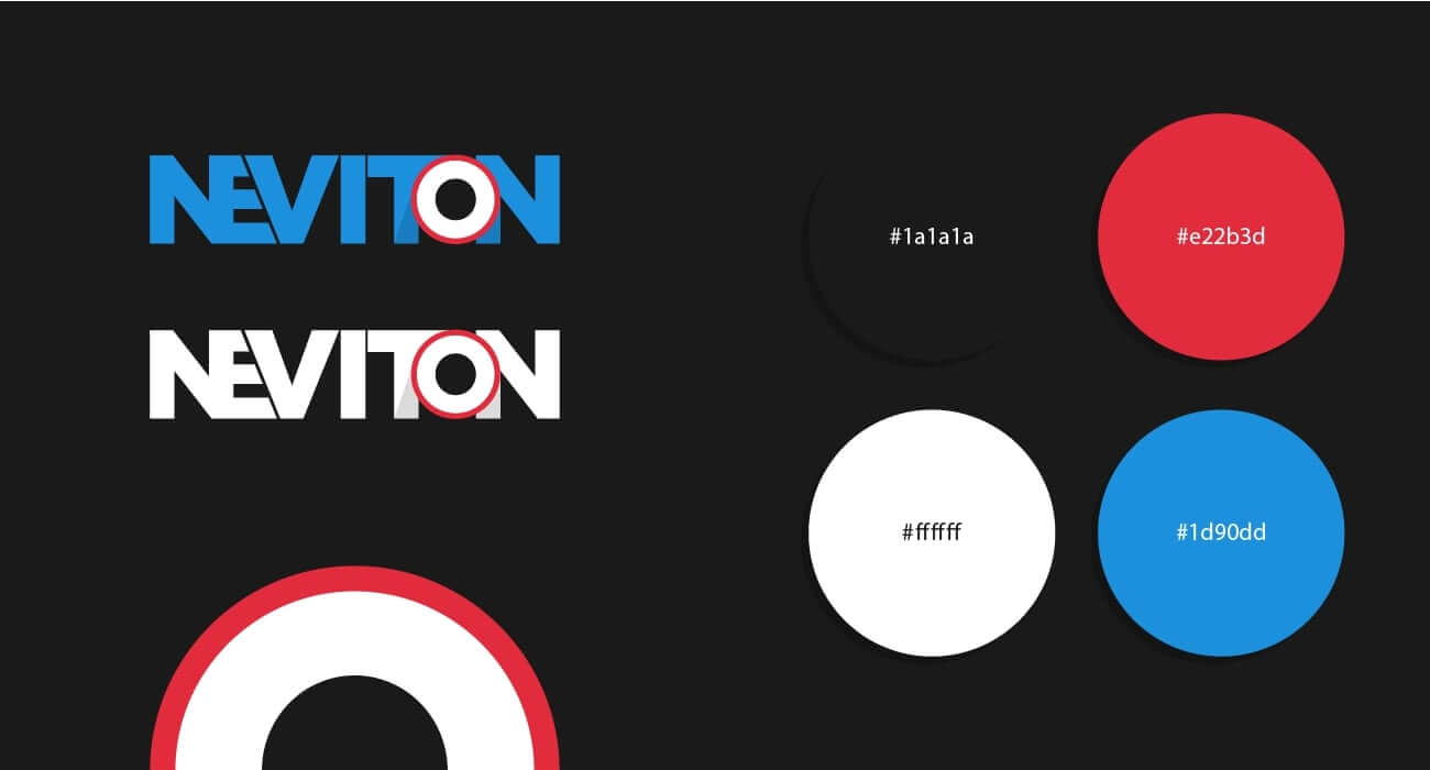
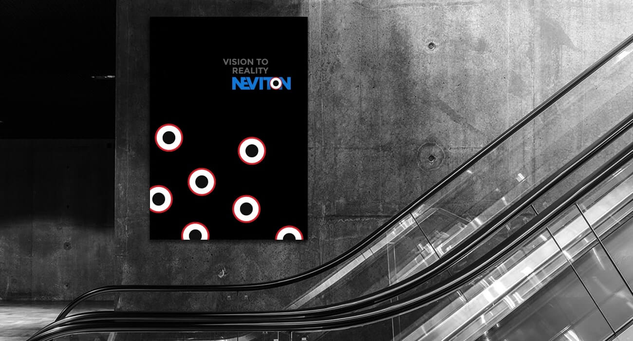

Having previously communicated with the team at Neviton, it was clear that their vision was to create a brand that was in up-keeping with modern IT trends. Upon working with different ideas, we’d decided upon using a font that was more technical and crisp in nature. We’d created a branding through the name that exemplified a sense of flow within it. To make the branding clearer, the “O” was replaced with a representation of a center. The center was an abstract representation of finding the best possible solutions (A prime mission of the brand itself) in a crowd of IT solutions.